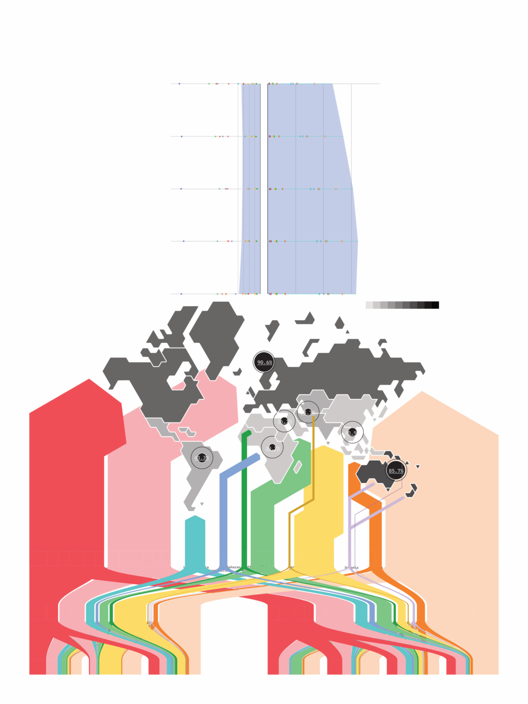
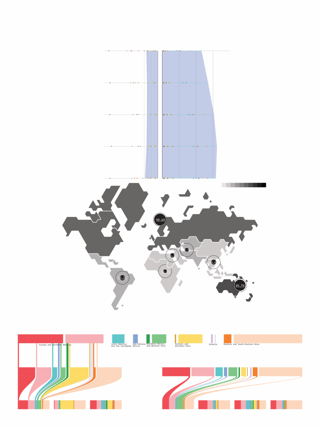
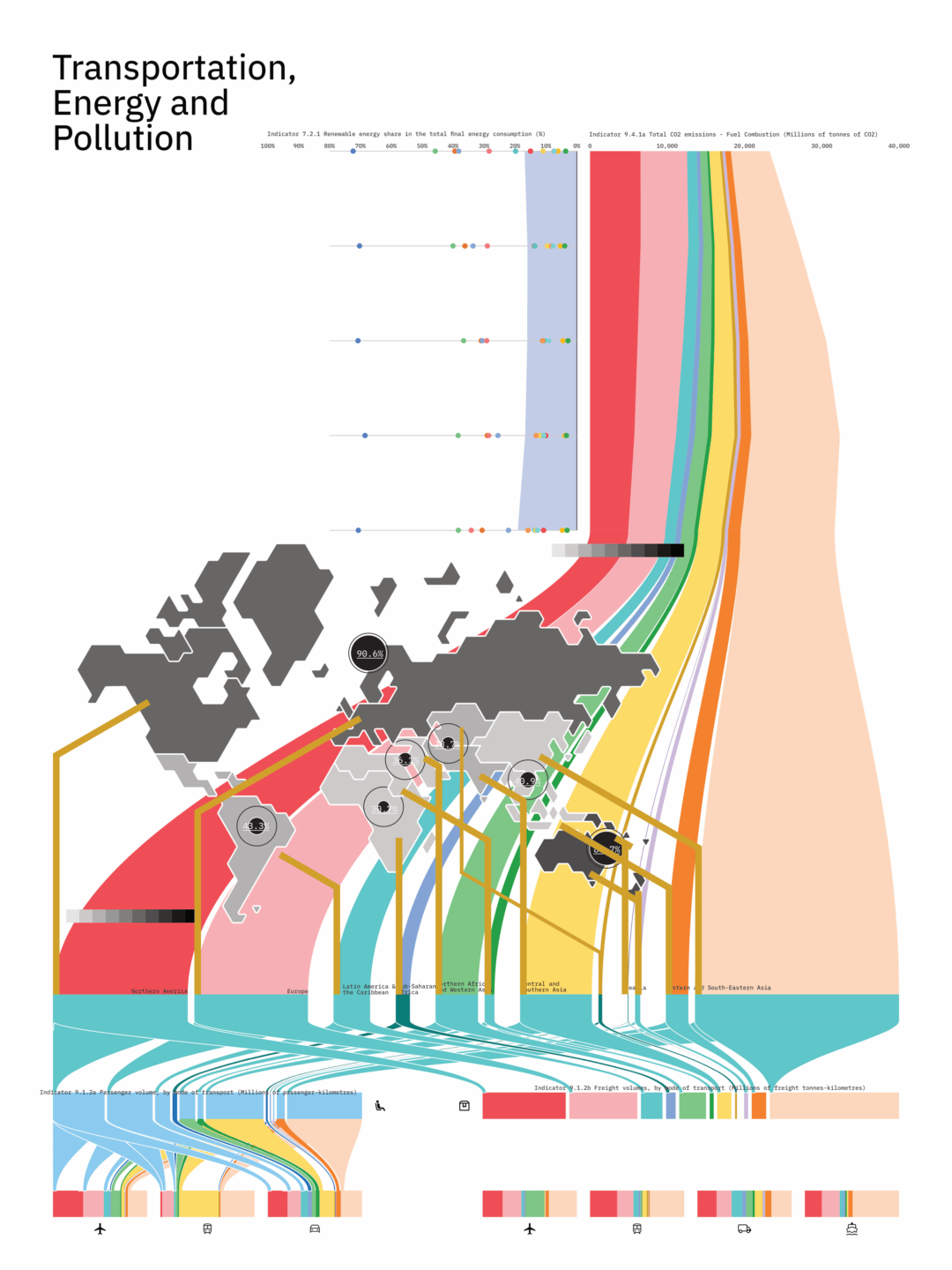
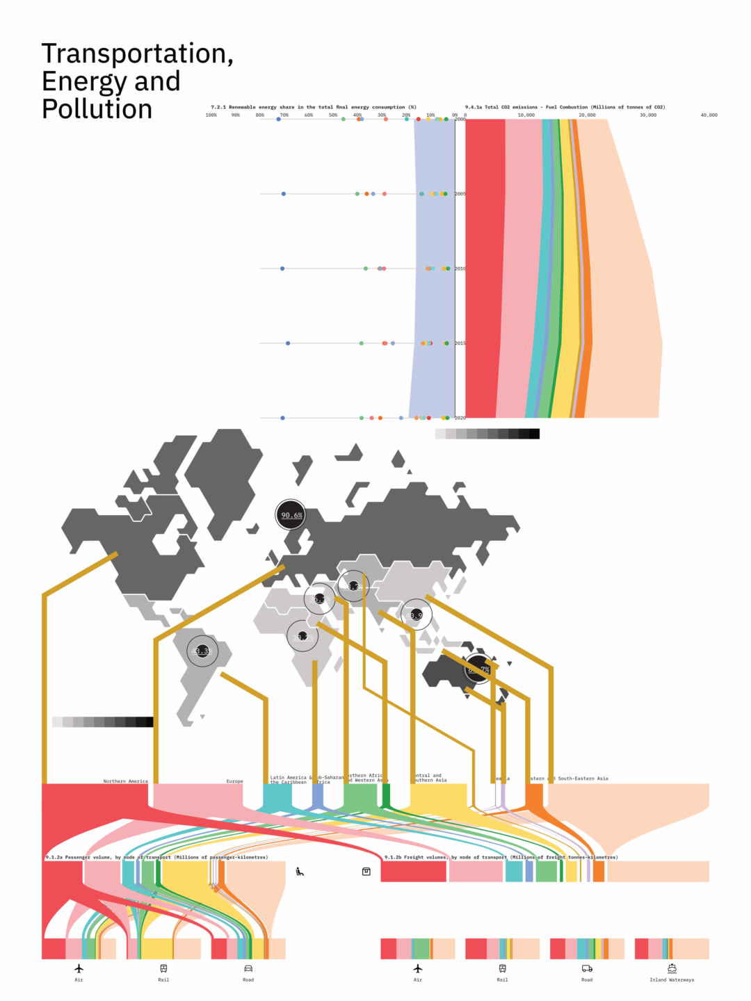
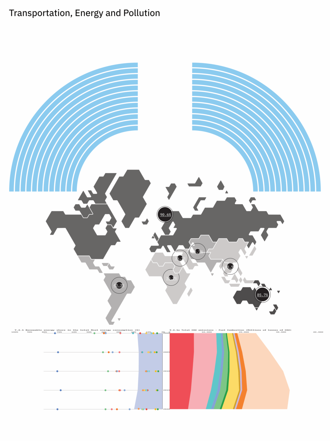
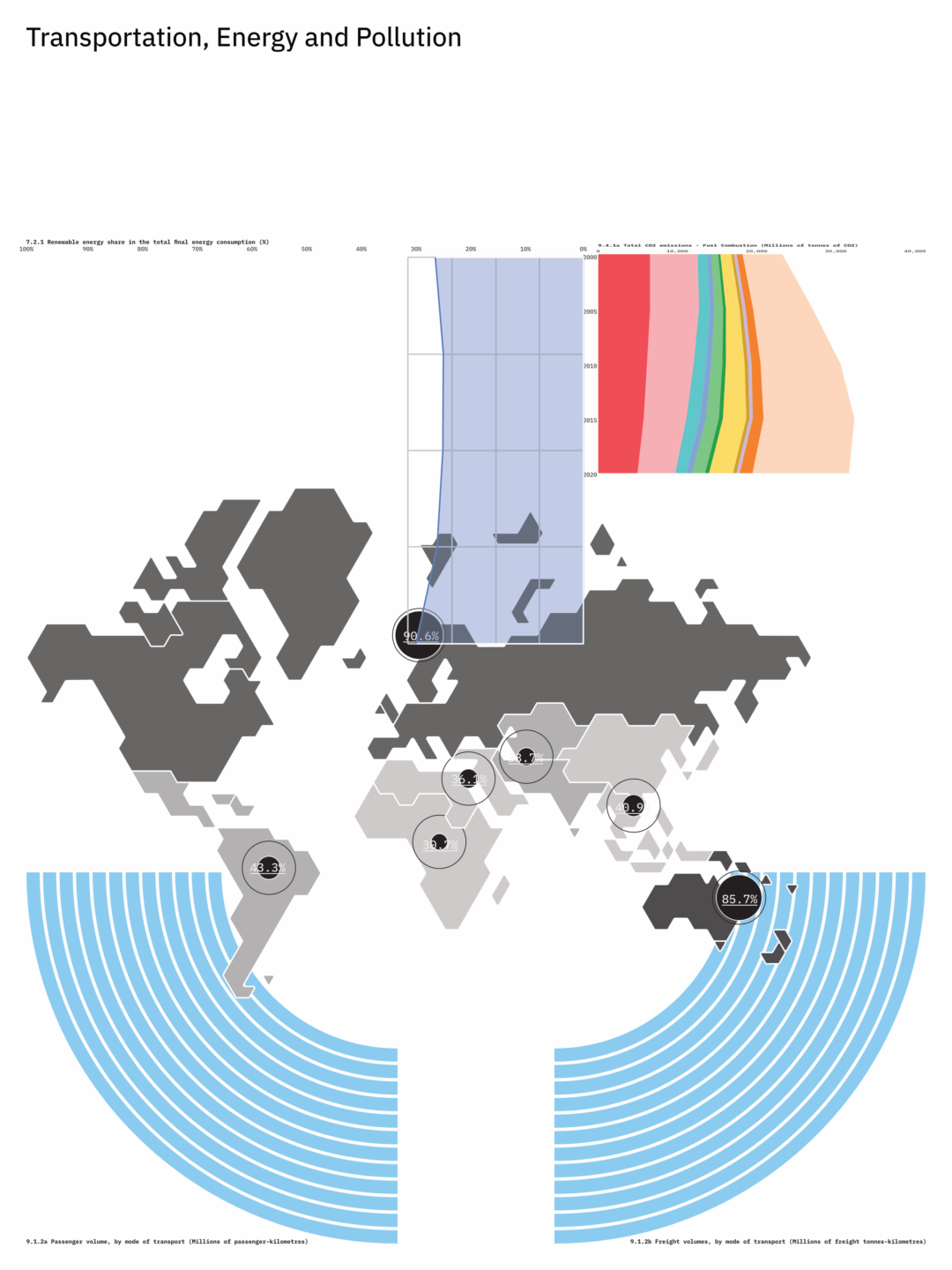
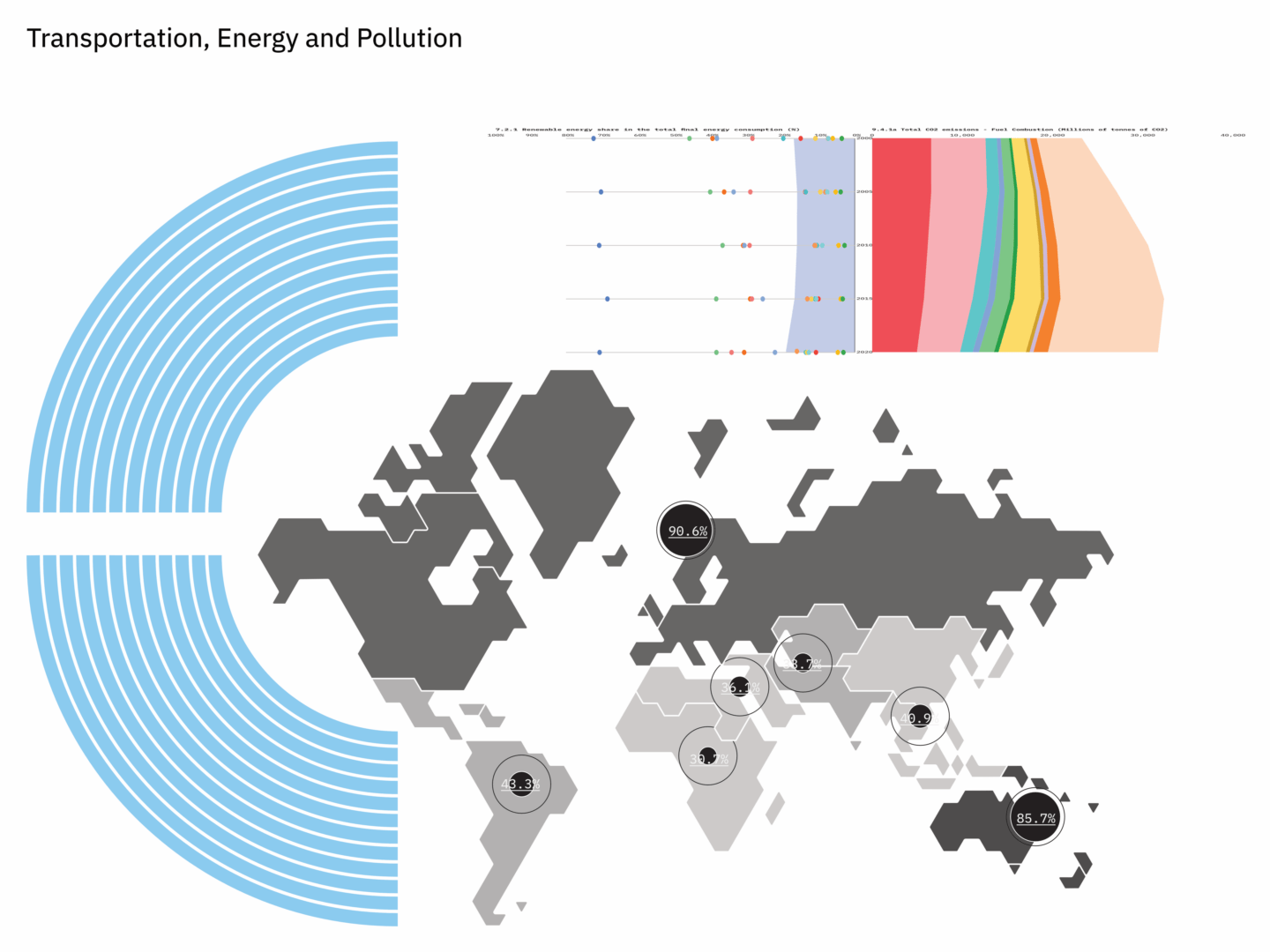
DESN 2021 - Information Design for UnderstandingTransportation, Energy, and Pollution
Visualizing Statistical Data – Snapshots of Progress towards the United Nations Sustainable Development Goals
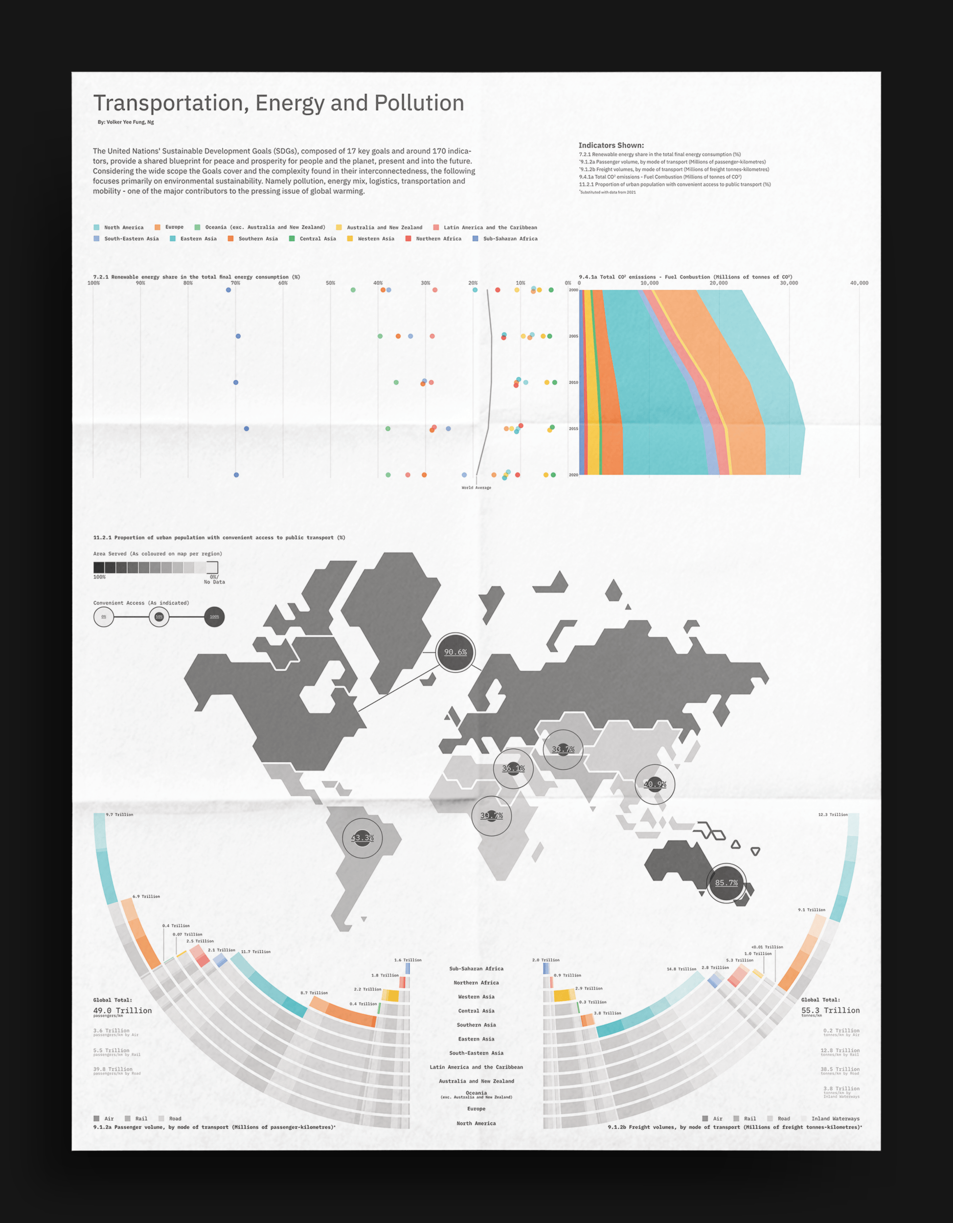
For our second project in the information design course, we were asked to study the statistics of the United Nations’ Sustainable Development Goals, select a top and visualize it.
This 18×24" poster is the result of that analytical process. While dense, I aimed to present the statistics as neutral and with as much context as possible so the readers can navigate, comprehend and draw up conclusions according to their own pace.
3 Sustainability Goals,
5 Sustainability Indicators,
and A Whole Lot of Charts…
Selected Goals and Indicators:
Goals
Goal 7: Affordable and Clean Energy
Goal 9: Industry, Innovation and Infrastructure
Goal 11: Sustainable Cities and Communities
*Goal 12: Responsible Consumption and Production
*Omitted in Final Design
Indicators
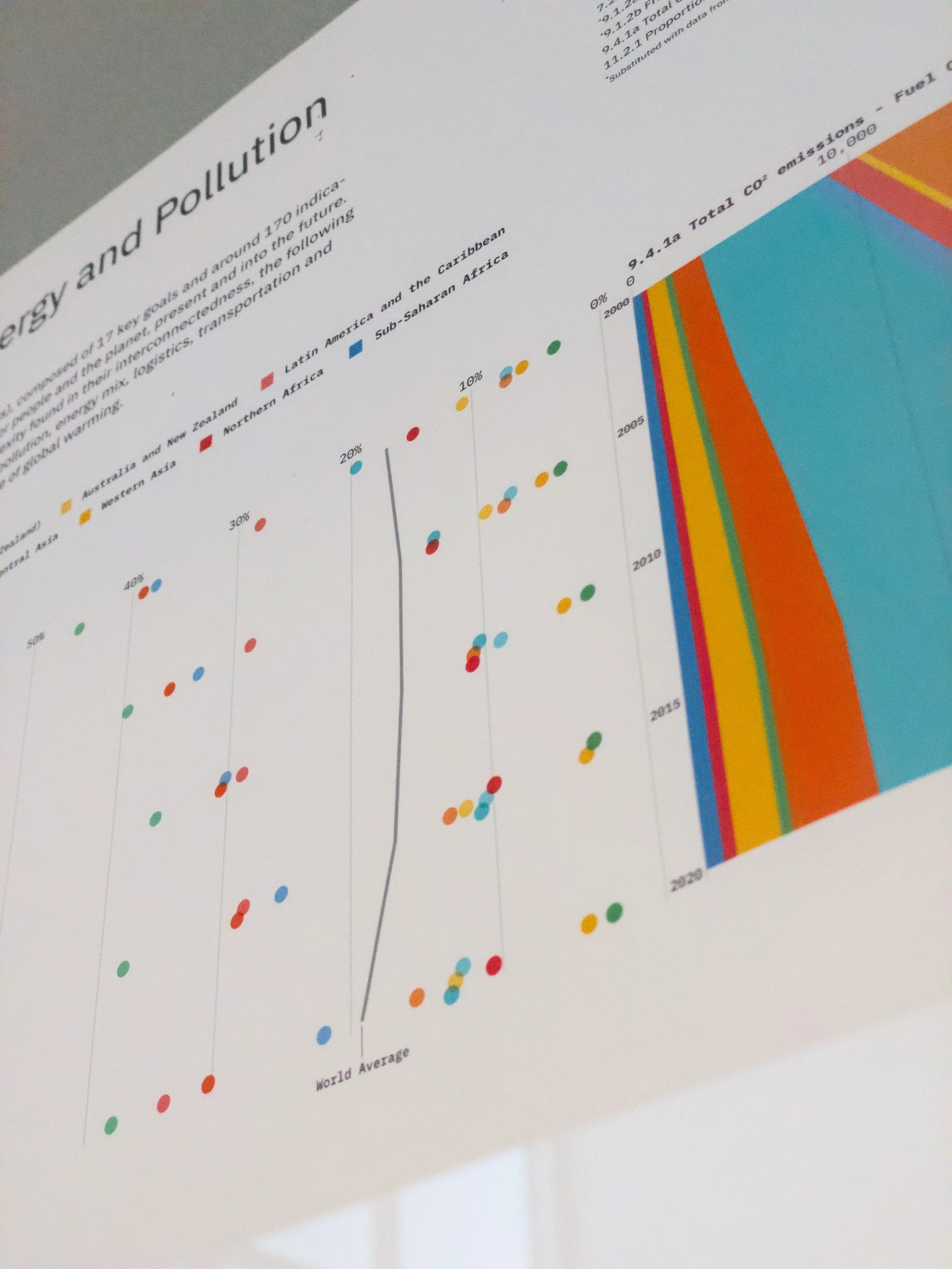
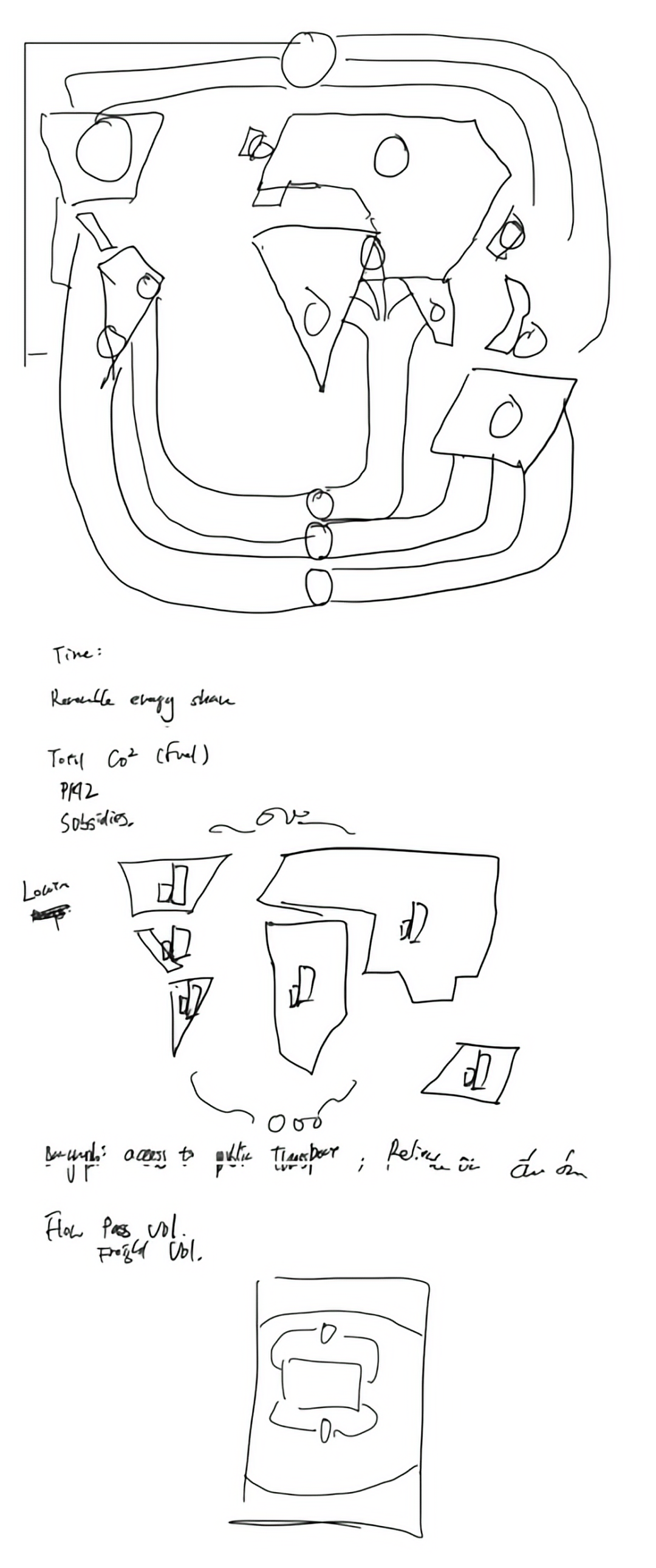
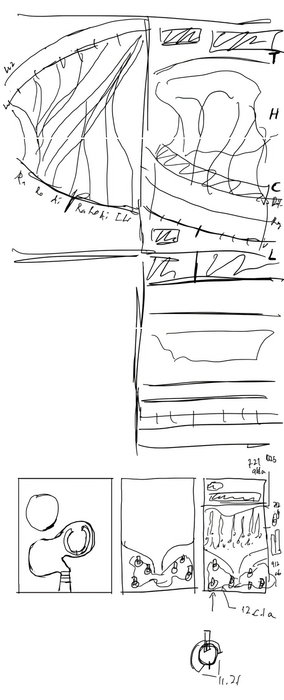
7.2.1 Renewable energy share in the total final energy consumption
*7.1.2b Proportion of population with primary reliance on clean fuels and technology
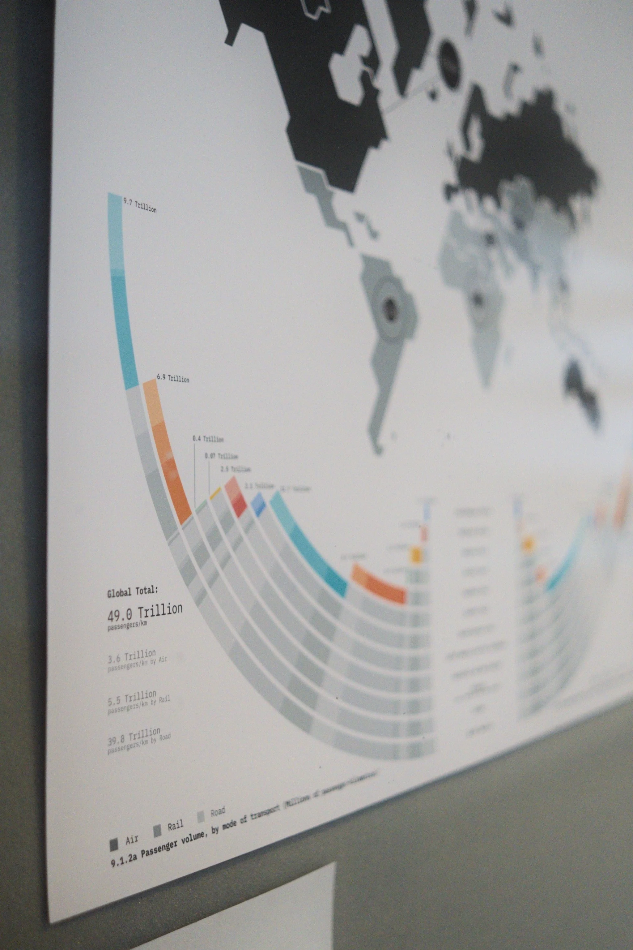
9.1.2a Passenger volume by mode of transport
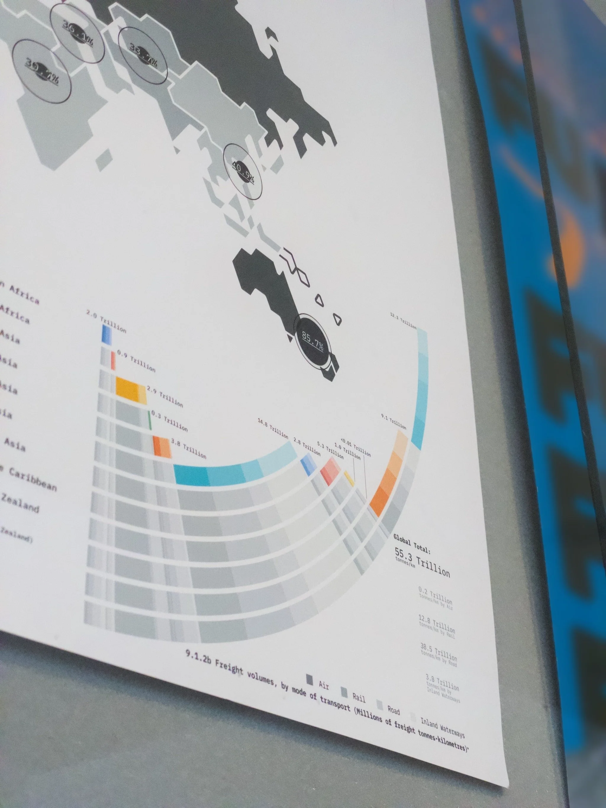
9.1.2b Freight volumes by mode of transport
9.4.1a Total CO2 emissions - Fuel Combustion
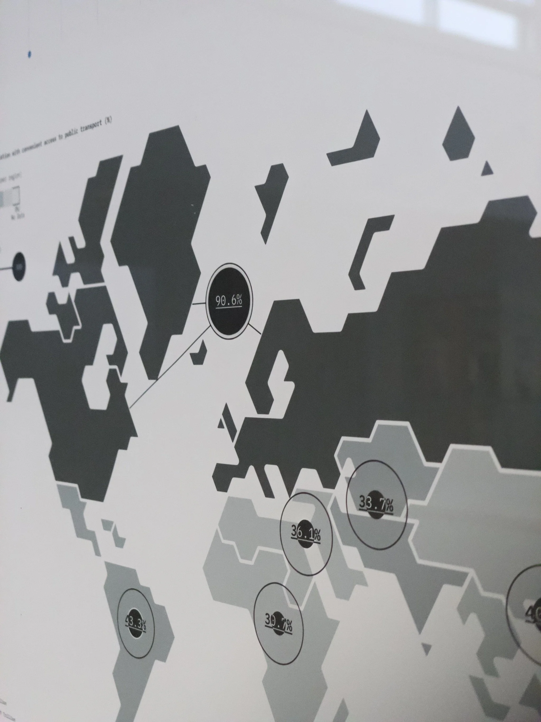
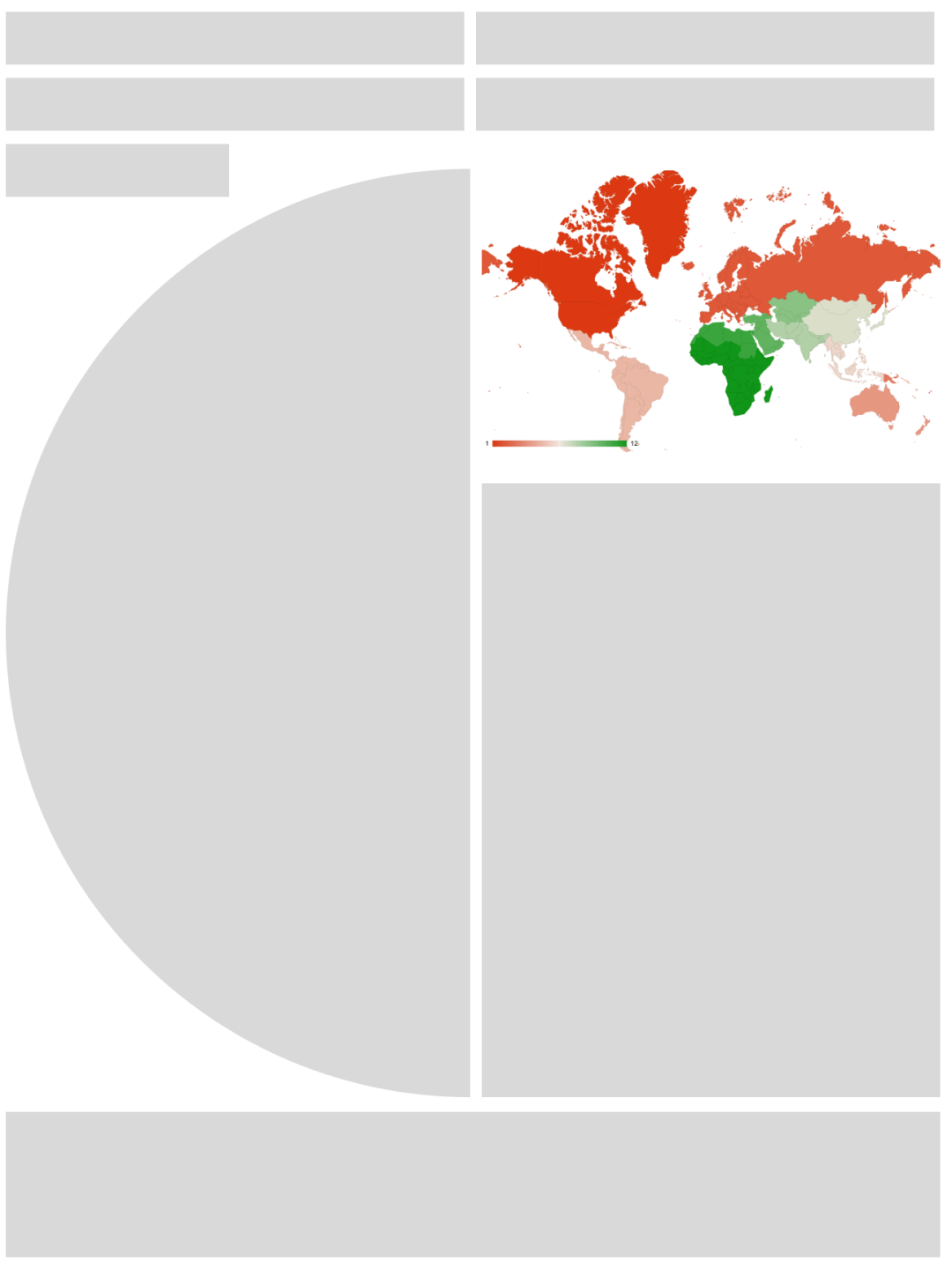
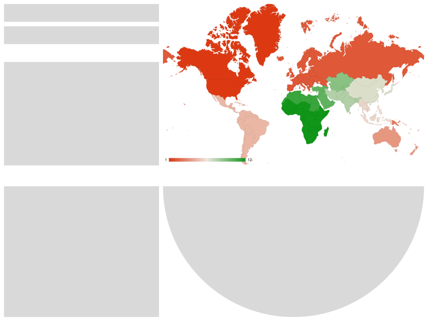
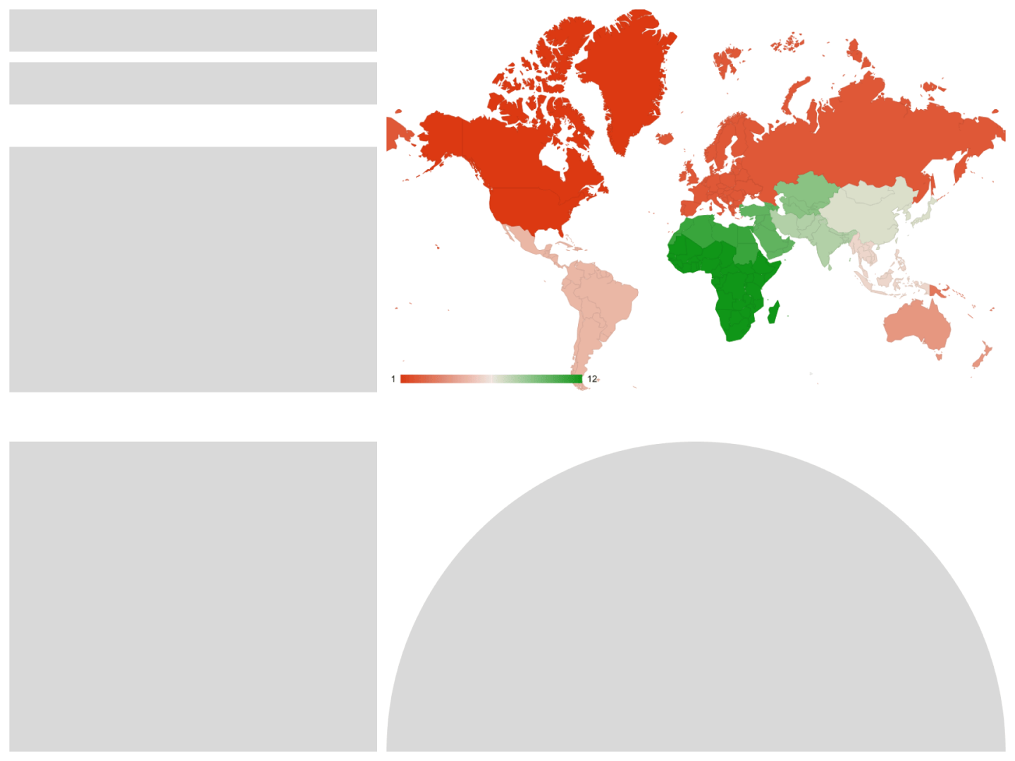
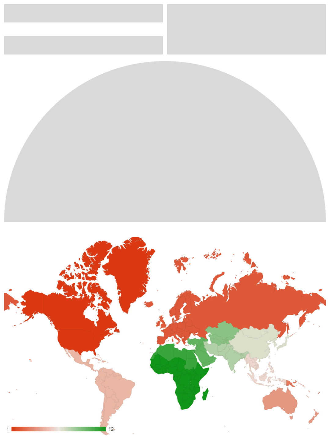
11.2.1 Proportion of population that has convenient access to public transport
*11.6.2b Mean annual concentration of fine suspended particles PM2.5
*12.c. 1a Fossil-fuel subsidies as a proportion of GDP
*Omitted in Final Design
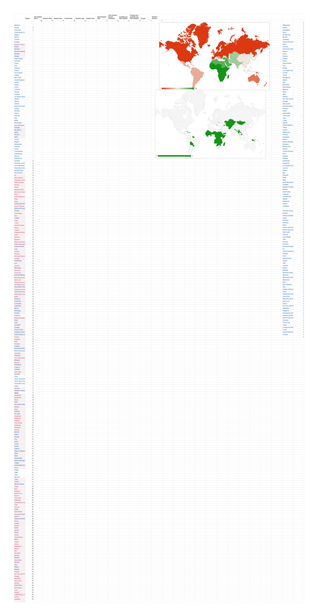
Design Process
Analysis:

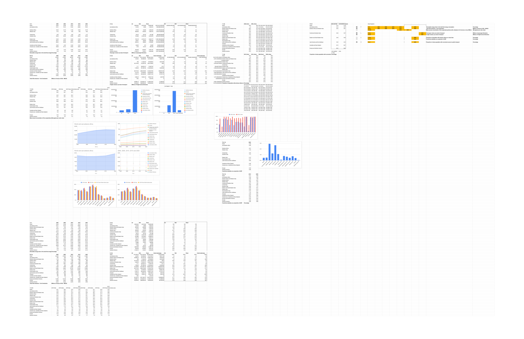
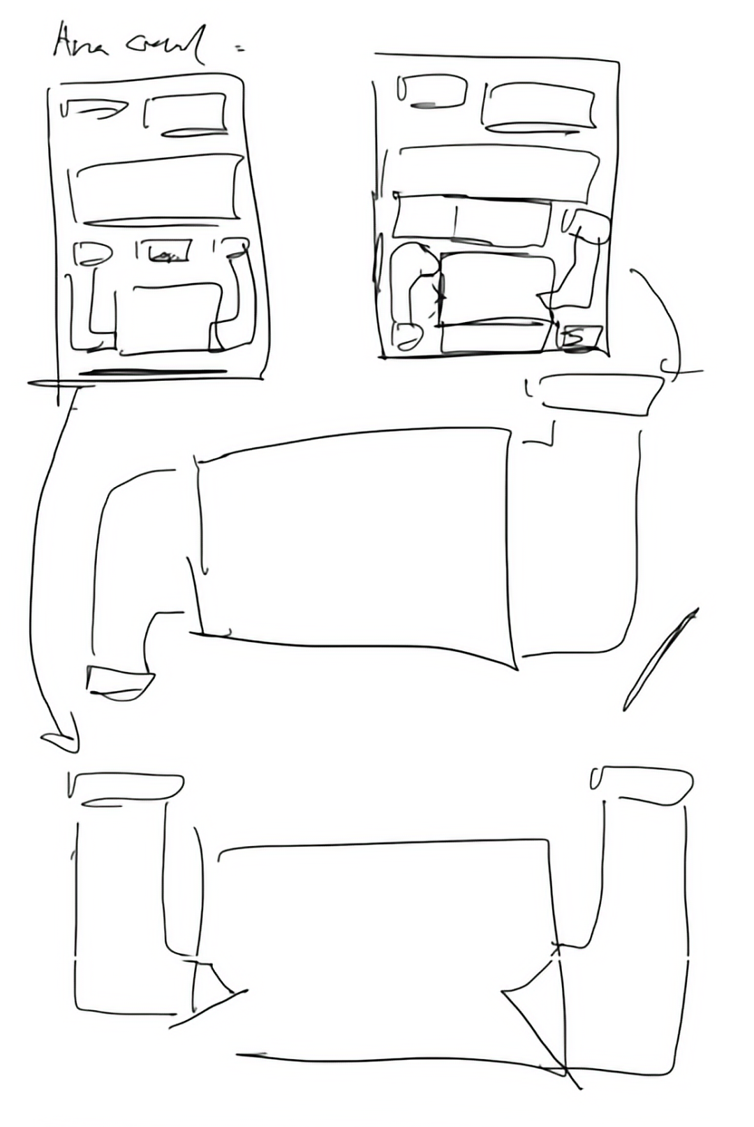
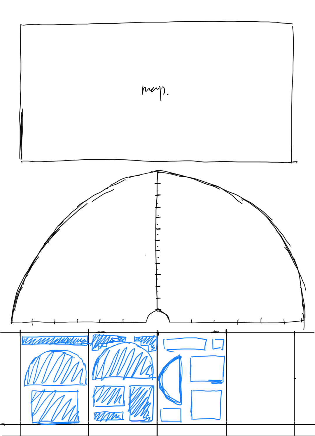
Sketches:
Ideation:


Refinement:

Final Output and Thoughts:
Thought this project, I learned and practiced the fundamentals of utilizing fine typography as a design tool to communicate, arrange, and create visual interest. Creating these posters, I gained a better understanding about conveying importance, differentiating types of information, and illustrating hierarchical relationships through typography. The skills learned are useful across all design disciplines, and I hope to further develop and refine them in future projects.